Squeaky Feet — Here's Your Perfect Storm
Album artwork, singles series and vinyl packaging.
Album art · Illustration · Packaging
About the project
Overview
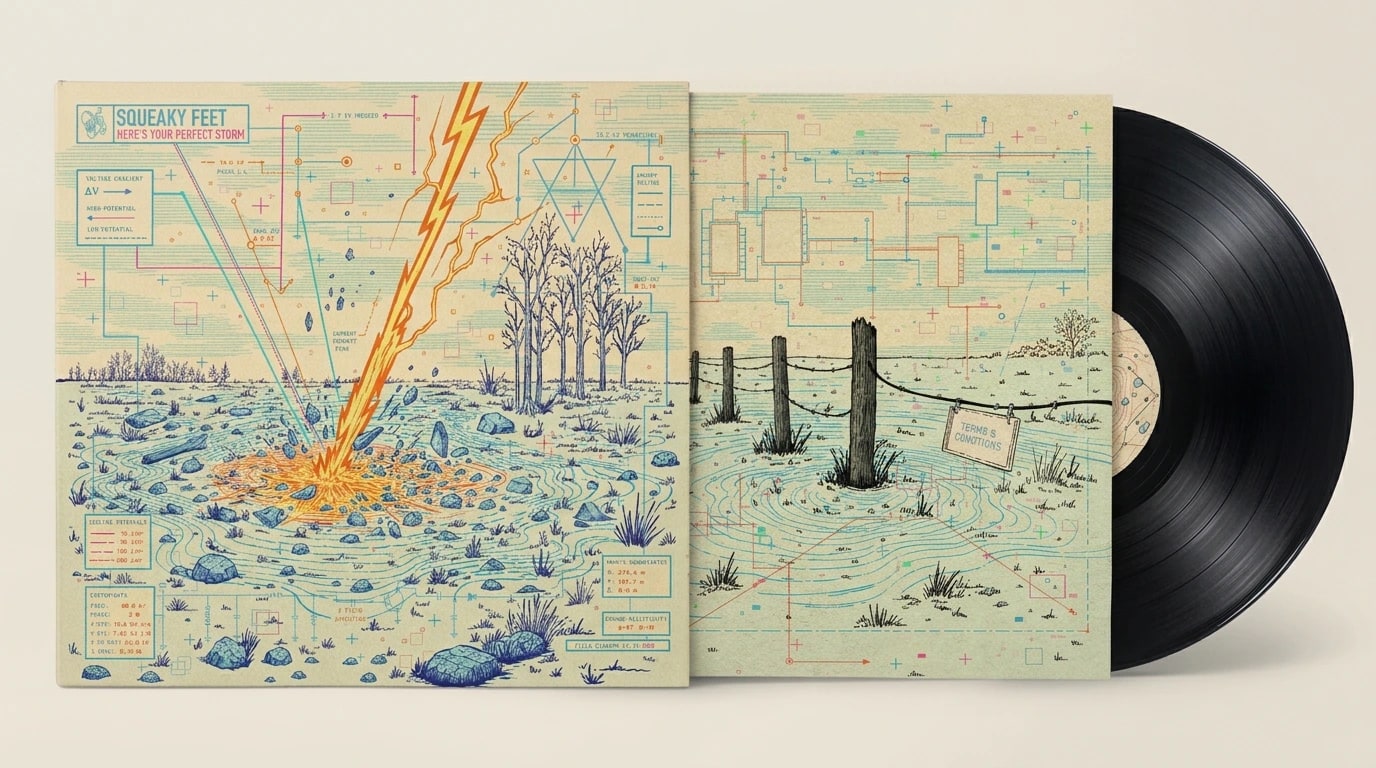
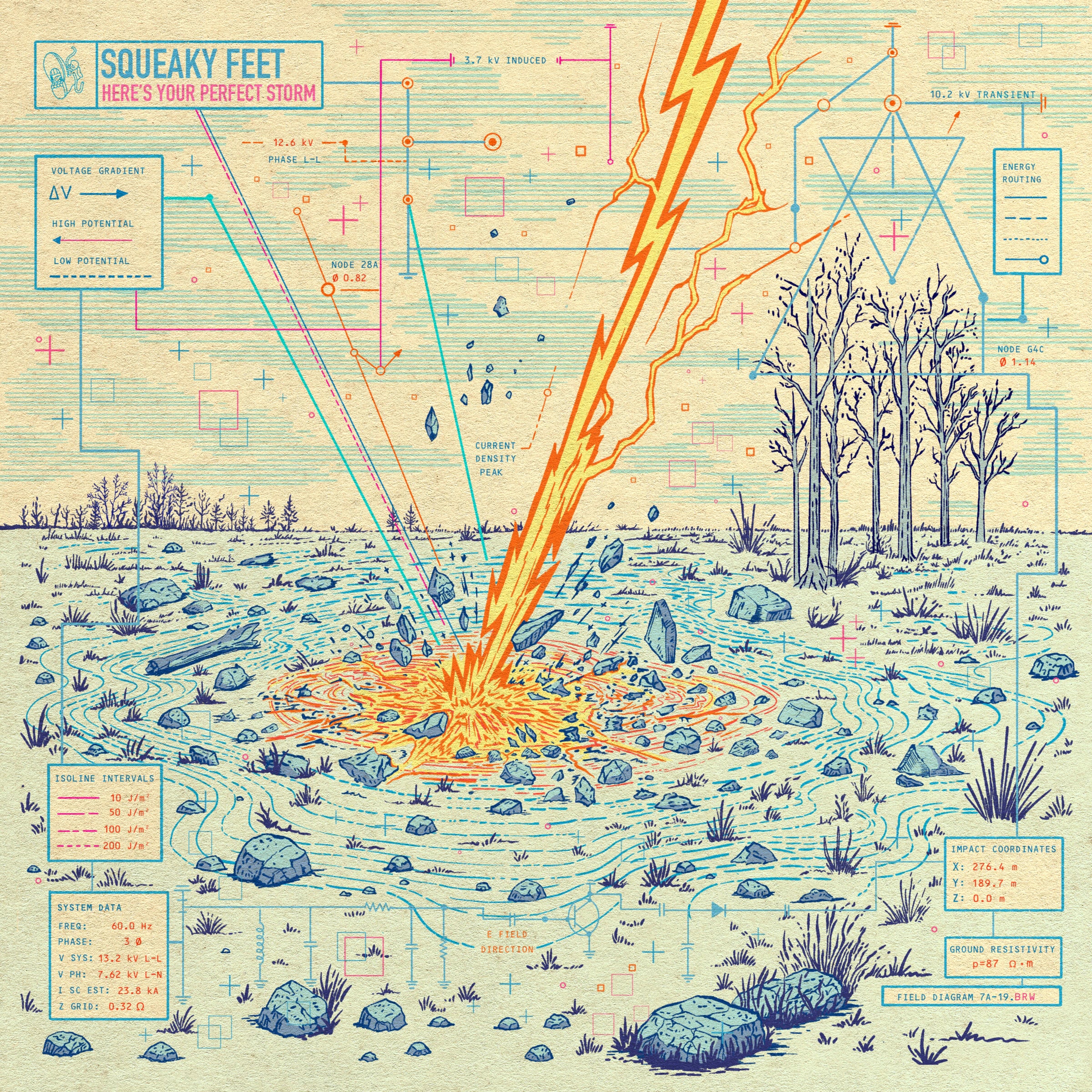
Here's Your Perfect Storm treats a storm as a piece of paperwork. The artwork is staged as a 1985 field survey: a bureaucratic document made by someone whose job was to measure, chart and file a lightning strike. The joke and the feeling are the same thing. You can grid it, label it and give it a revision number, but you can't contain it. The title works the same way: a calm, official handoff of something completely out of control.
Concept
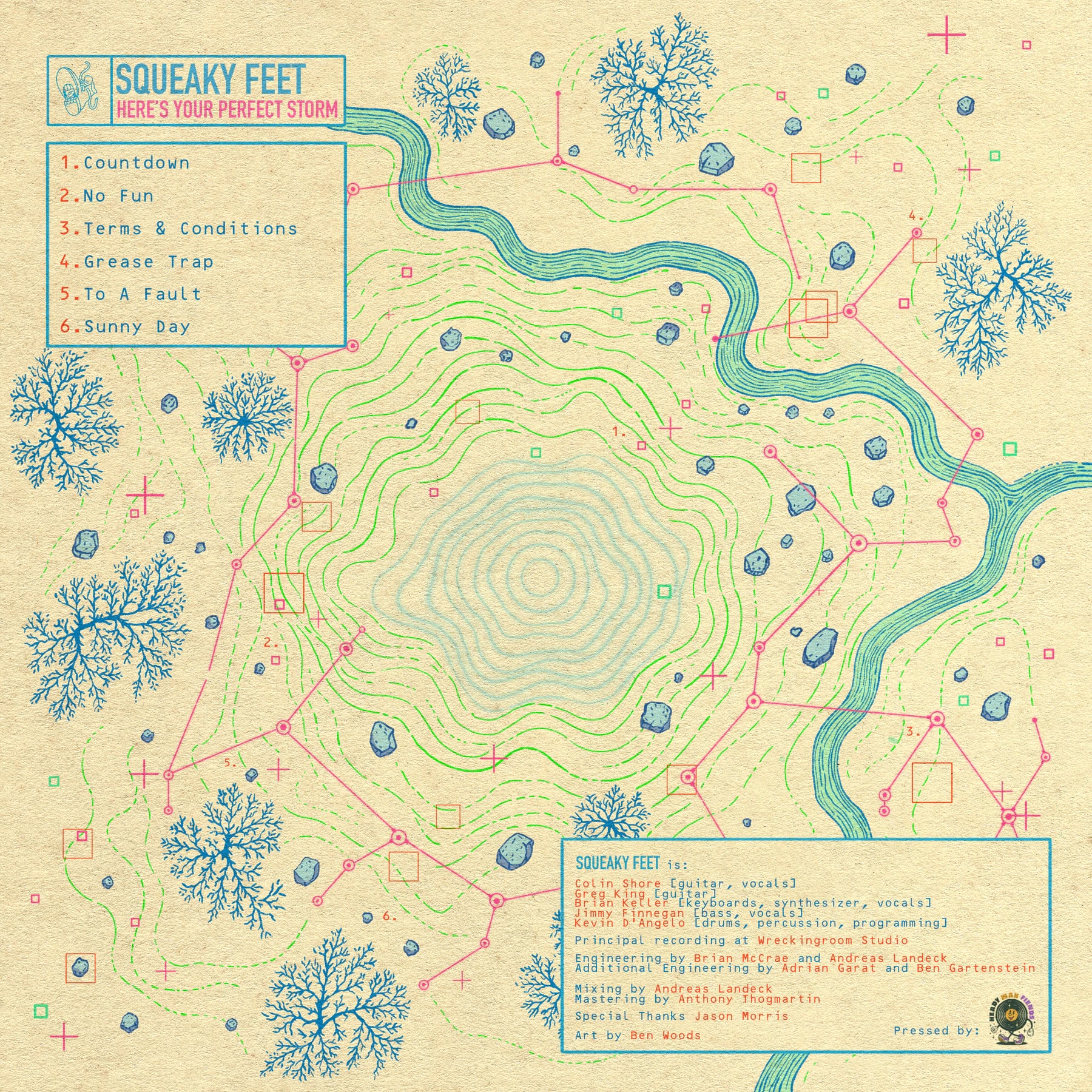
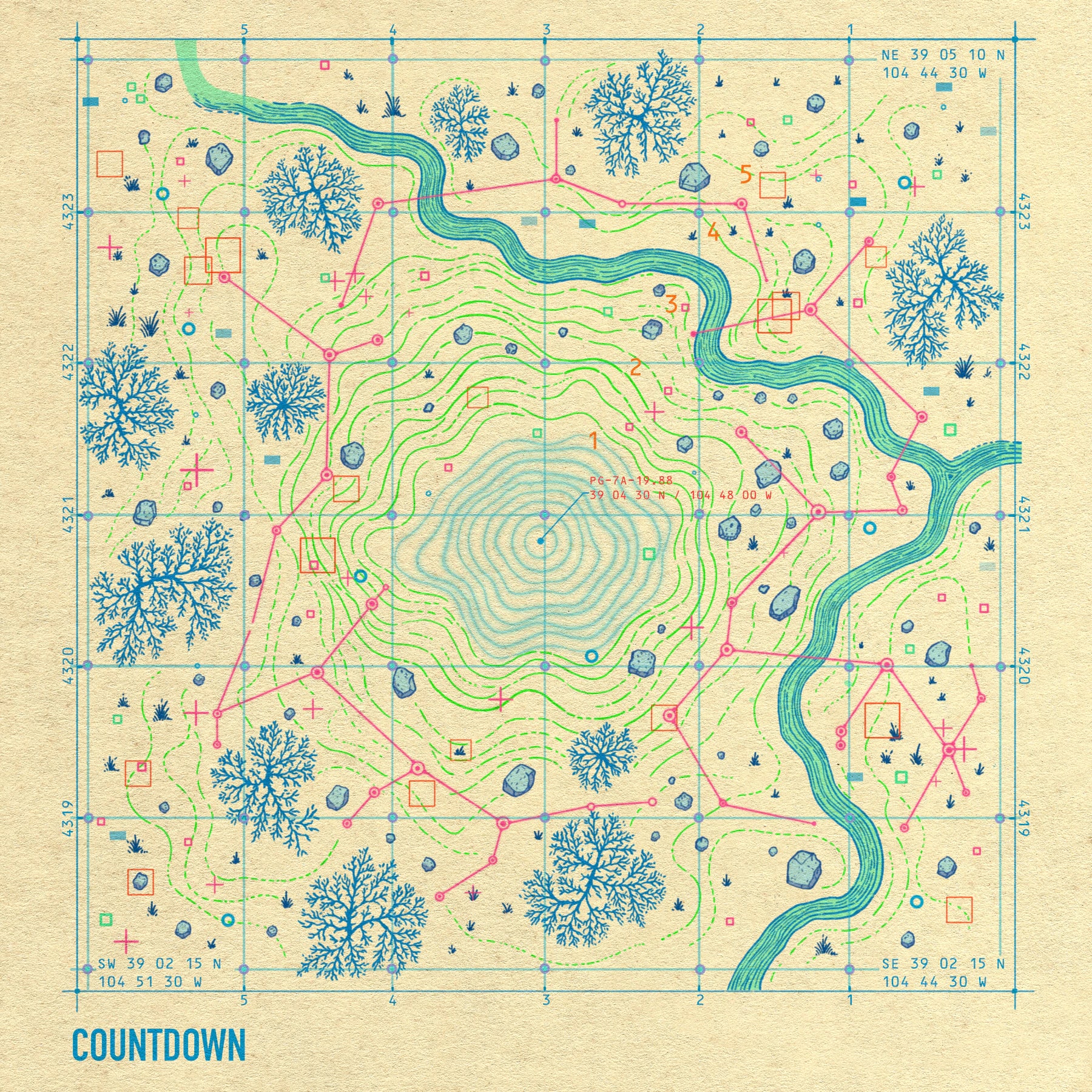
The cover is drawn as Plate 17A, a technical record of a single strike hitting marshy ground. It's laid out on a kraft-paper sheet with an electrical grid diagram over the landscape. Every number on the sheet is meant to hold up if an engineer reads it. The system data uses a real North American distribution spec (13.2 kV line-to-line, 7.62 kV line-to-neutral, 60 Hz three-phase). Ground-potential isolines follow real decay intervals. The strike sits at 39°04'30" N, 104°48'00" W, on Colorado's Palmer Divide, which has the highest cloud-to-ground lightning density in the state. That's a nod to the band's home. The grid reference PG-7A-19.88 became "Palmer Grid" after the fact.
This one is personal. Before design was my full-time work, I spent seven years mapping electrical grid infrastructure. This record let me turn that world of one-line diagrams, survey grids and system specs into something expressive.
Process
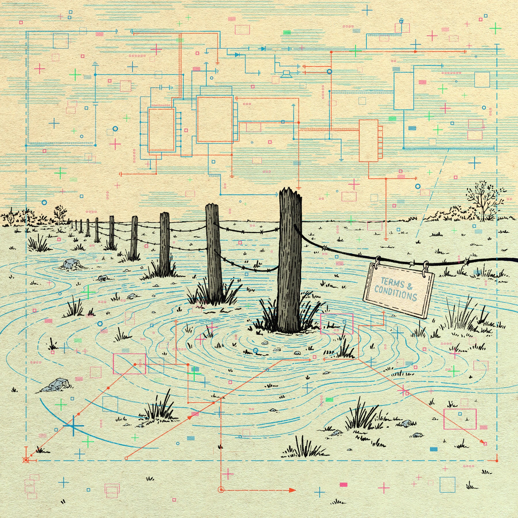
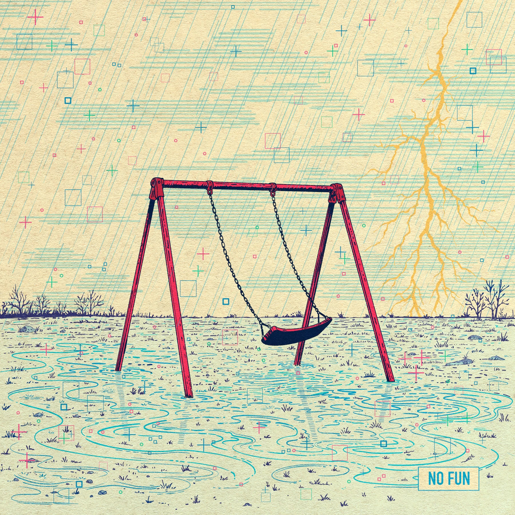
03 detailsThe illustration was drawn by hand in Procreate. All tone comes from line density, with no gradients or airbrush. Storm clouds, rocks and vegetation are built from hatching, stipple and ruled lines, like a steel engraving in an old engineering textbook. Detail drops off with distance. Foreground rocks and the impact zone get full stroke-by-stroke rendering, while the background goes to simple stippled silhouettes. The result reads as atmospheric depth, the way an antique plate engraver would handle it.
The technical layer was drafted to match period conventions. It includes leader lines, callout boxes, dashed construction lines, node markers and a revision block (REV B, dated 06.14.85). The margins hold a hobbyist sferic-receiver schematic, the kind of circuit someone in 1985 might build to detect lightning, with real component symbols and part numbers. The lettering is set in OCR-B to echo Leroy and Rapidograph drafting. It was placed by hand in Illustrator so every label stays crisp and legible.
Palette
05 inksFive inks on kraft:
Blueprint blue
linework and annotation
#2184B1
Hot magenta-pink
isolines and the energy of the strike
#FA4098
Orange
survey markers and callouts
#FB6E1A
Cyan
the schematic layer
#08A1BF
Deep indigo
illustrative hatching
#222462
The Singles
03 singlesEach single is another plate from the same survey: a different spot around the strike, drawn to match its song.
Vinyl
02 imagesThe packaging was pressed with Pour House Pressing. It includes a 12" jacket, an 11×11 insert and center labels that carry the isoline rings onto the record itself, with pink for Side A and cyan for Side B.